Advertising Opportunities
If you have a message to display, take a look at some of the advertising opportunities provided by the City of Greater Sudbury. With advertising locations in several high-traffic areas, your message is sure to reach its audience!
Bell Park Digital Billboard
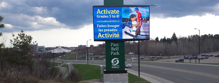
Promote your event or community group on our high definition digital billboard!
It is located near the Grace Hartman Amphitheatre at Bell Park and is passed by over 30,000 vehicles a day along with numerous pedestrians, cyclists and visitors to Bell Park.
For more information or to book the digital billboard, call 705-674-4455 extension 2446.
For more information or to book advertising space please call 311.
Community Centre and Arena Billboards
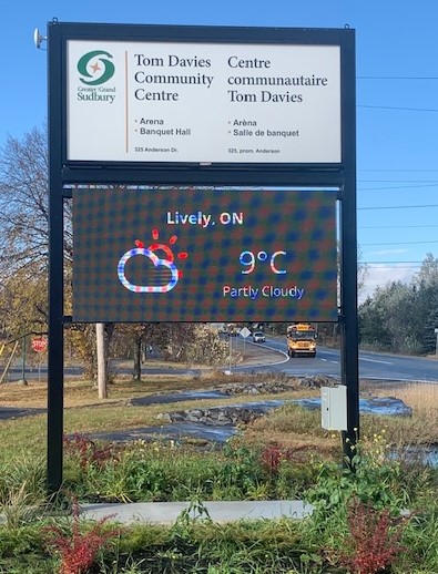
You can advertise on the digital board at TM Davies Community Centre and Arena in Lively.
Rental fee: $127 for two days or $165 for weekends (includes H.S.T.)
For more information, call 705-674-4455, extension 3441 or 3443.
Digital Board Design and Layout Recommendations
When designing an ad for a digital board, consider the below list of best practices to ensure your ad is reaching its fullest potential and largest audience possible. Is it clearly organized, quick to read and accessible to all?
Best Practices
Text should be large enough that it can be easily read from a distance. Use simple fonts, large text and contrasting colours. Lettering should be a minimum of one foot tall.
Stick to limited text. Keep it as short and concise as it can possibly be.
Follow the 3x5 rule. Limit the amount of text to three lines of text, each with 5 words or less, or 5 lines of text with 3 words or less.
Read time is 5 to 10 seconds. Try not to use more than 15 words and keep them short for easy comprehension.
If the purpose of your ad is to promote an open house, public meeting or special event, ensure that your message is strong, clear, and concise with key dates, times, and location.
Visuals are an extremely powerful component of design. They should always add to your message, avoid complicated, unrelated images.
Less is more, don’t fill your display with everything you can think of, as the message will get lost.
There should be a call to action
Design for Accessibility
As part of the Accessibility for Ontarians with Disabilities Act (AODA), all electronic and information technology must be accessible to people with disabilities. As such, there are a few things to consider to ensure that your digital ad is AODA compliant. To learn more about the current AODA standards, visit the Accessibility for Ontarians with Disabilities Act website.
Colours
Use bright, bold colours
Stick with fully saturated web-safe hues. Complimentary colours, such as red and green, are not legible together because they have similar value. Contrasting colour combinations work best for viewing outdoor designs at distances.
The colour of your text should be in high contrast with the background. This will ensure better readability for the visually impaired.
Colour contrast checker: aodacolours.com
White Backgrounds Are Not Recommended
To achieve white, a combination of three colours must be turned on to their maximum brightness. White backgrounds will also wash out and compete with text and images.
Fonts
Use Sans-Serif fonts- Serif fonts should only be used for long paragraphs which should never appear on digital signage. Ideally, keep to Bold face Sans-Serif as these are the easiest to read at a glance. Helvetica, Arial, Verdana and Open Sans are all great fonts to use in digital signage design.
Two fonts or fewer- Use two fonts or fewer in your designs. The more fonts you include, the more contrast you’re creating, which can make your design appear busy and difficult to read.
Italicizing- Italicized text is harder to read at a glance. If you need to italicize, do it sparingly, keeping to 2 words or fewer.
Capital letters – Try and avoid using all capitals or block capital letters, as it is difficult for those with visual disabilities to determine what the letters are. When there is no height difference between individual letters, it can be difficult at distances to read and can cause words to appear blurred together.